

About
The Last Bookstore is the largest new and used bookstore in LA. They are proud to be a part of their dynamic communities. Their customers are varied — ranging from local residents to other small businesses.
Current website: https://www.lastbookstorela.com/
Role
Researcher, designer
Time
July 2024
Methodology
User interviews, Usability Tests, Plus & Deltas, Cart Sorting
Problem
Business Request and Goals
-
Enhance the website to boost conversion rates.
-
Focus on quality with a curated inventory.
-
Retain "small shop" appeal while showcasing products.
Problem Statement
Customers struggle to locate books and categories on The Last Bookstore's website due to confusing navigation and overwhelming information, leading to a poor browsing experience.
(Based on user insights)
.png)
HMW and Solutions
HMW
How might we ensure users feel confident in locating some new reads they are interested in?
Implemented a simple, scannable navigation bar
Simplified overwhelming information
Established a straightforward shopping process


Design Process
Discover
Define
Ideate
Design
Competitive Research
Usability Test
User Interview
Persona
Card Sorting
Site Map
Sketches
Wireframe
Design System
Usability Test
Mi-fi
Hi-fi
Discover Phase
Competitive Research
To get more inspiration on the standard features of an online bookstore, I analyzed three mainstream bookshop websites: Amazon, Barnes & Noble, and Bookoutlet. The analysis helped me recognize gaps in The Last Bookstore's offerings compared to its competitors.
Plus & Delta

Clear category
Overwhelming navigation

Summary of reviews
Lack of consistency

Minimalist navigation
Limited formats of books
Understand the Users
I decided to conduct usability tests with five first-time users to better understand their experience and potential improvements to the website at the beginning stage.
Usability Test
Do I click here?
The landing page is kind of confused
There is tons of information!


Why is there a completely different aesthetic design?

I can't find the category I am looking for...

Define Phase
Who are our users?
In the UX design process it is important to always keep the users at the forefront of all design decisions. So, after an initial scope, I conducted five interviews with people who usually shop for books online. Based on the characteristics of my participants, I bring up the persona Mia.
Persona
Mia Gloss
Age
25
Female
Status
Single
Gender

"Sometimes, I feel like I’m scrolling forever without finding something I really want."
Mia is a 25 year old data analyst living in a quiet suburban neighborhood of Seattle, WA. Mia enjoys the convenience and portability of digital books.
-
An easy-to-navigate website with a clean, minimalist design.
-
A clean, minimalist design.
-
Other users' review
Needs
-
Felt confused about finding the section or book category she was interested in.
-
Spend time searching for the book she is looking for.
-
Overwhelmed by the amount of information
Frustrations
Reorganize the Navigation
According to the usability tests, to address the issue of "hard to find a specific category," I conducted several closed card-sorting sessions to improve findability for users based on their understanding of various categories, resulting in the following site map.
Card Sorting &
Site Map

Ideate Phase
Ideas
After gathering all the data from the research stage, I developed an initial idea and visualized the solution through sketches. The primary user flow I focused on was: "Mia, as a first-time user, wants to browse the bookstore to find a new science fiction book to read."
Sketches

Bring up to Mi-fi
Before I came to the mid-fi wireframe with colors and typefaces, I created a basic design system inspired by the physical bookstore’s interior to keep consistency across the site and enhance its brand identity.
Design System

Design Phase
Landing Page
Problem
Solution
-
Confusing navigation
-
Overwhelming information
-
Lack of aesthictic
-
Scannable Navigation
-
Clean layout
-
Brand identity


Book Listing Page
Problem
Solution
-
Inconsistency with landing page
-
Lack of visibility
-
Take several steps
-
New design system
-
Breadcrumbs
-
Streamline the process


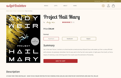
Product Detail Page
Problem
Solution
-
Long Description
-
Complex information
-
Quick summary
-
Good hierarchy


Conlcusion
What's next?
For the next step, it's crucial to enhance our book recommendations by aligning them more closely with user preferences and providing richer details, such as sample chapters. This approach will streamline the discovery process for avid readers, allowing them to explore new books more efficiently.
Next Step
What I learn?
Overall, this solo project was a challenging yet enriching educational experience for me. As my second UX research project, it presented a relatively heavy workload within a two-week timeline, but it also offered significant insights into the general flow of conducting research for me. Additionally, I gained a deeper understanding of the importance of time management. Moreover, the project allowed me to explore various research methods, enhancing my ability to comprehend user needs from different perspectives.